
Megamenu, Interaction Design
Skills:
Product Design & Scalable Solutions
Design Systems
User-Centered Problem Solving (with limited data)
Cross-functional Leadership
Stakeholder Management
Product Design | UX Strategy
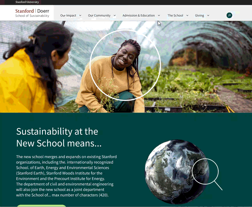
When Stanford University launched a groundbreaking new school that reimagines academia—uniting departments, institutes, and an accelerator into one integrated ecosystem—the digital presence needed to match that ambition.
Phase 1: Building the Foundation
I drove design operations for the school's initial website, coordinating between external design agencies and in-house developers to establish the foundational design system and CMS implementation that showcased the school's mission and core values.

Phase 2: Scaling for Complexity
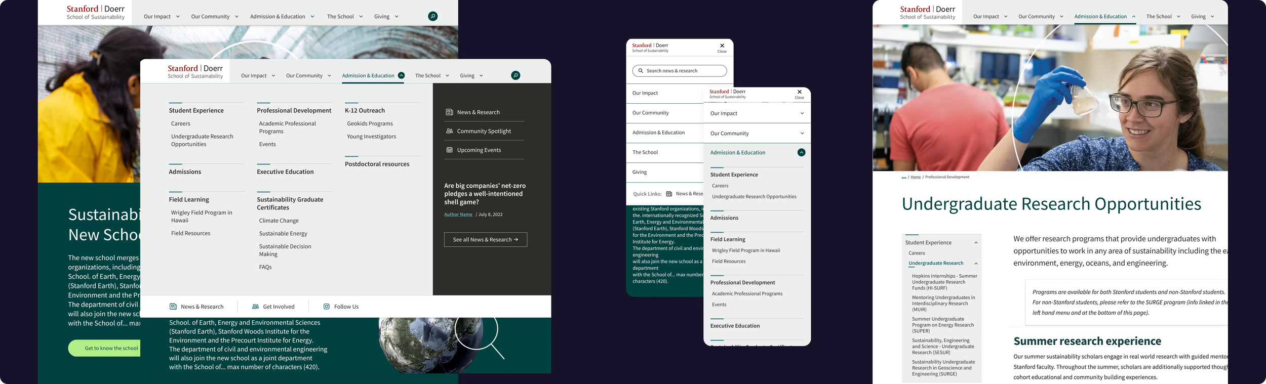
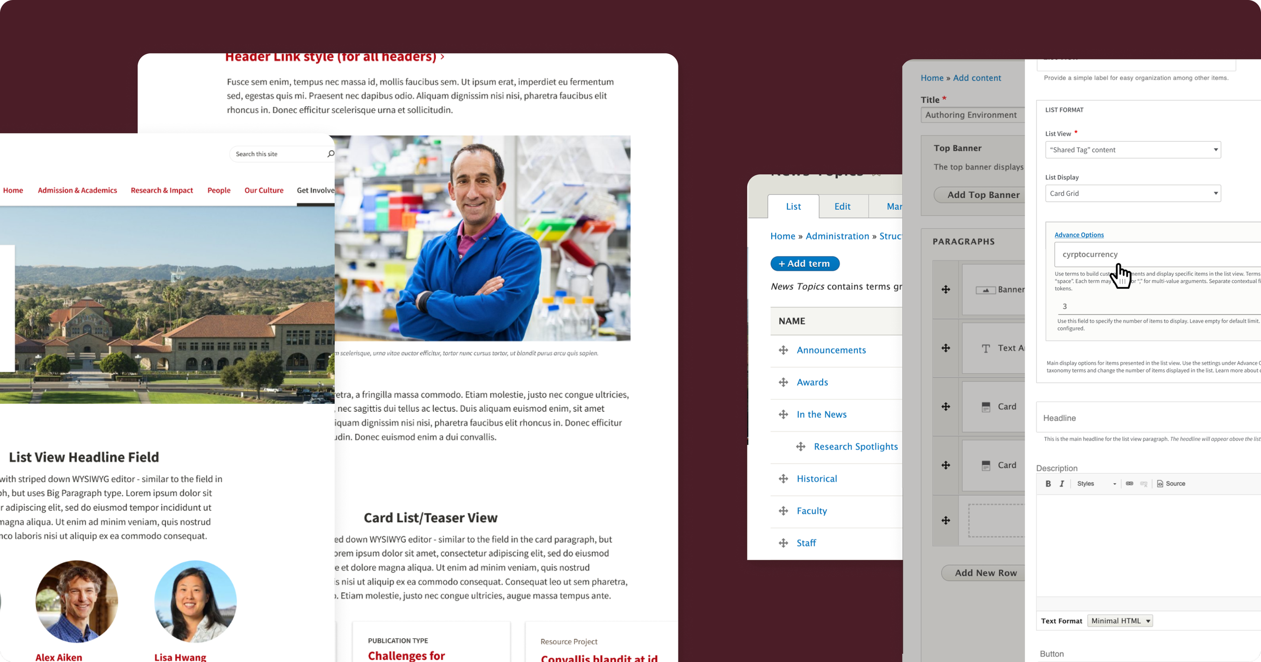
As the school took shape, the website rapidly evolved into a 50+ page integrated ecosystem serving diverse audiences—from prospective students to industry partners and researchers. The initial navigation, designed for simplicity, couldn't scale to meet the emerging complexity.
I was tasked with redesigning the navigation into a scalable system that could grow with the school's ambition while maintaining clarity and usability.
Note: While stakeholder approval was secured, leadership and budgetary changes shifted priorities. This case study showcases the design process, strategic problem-solving, and solutions developed for future implementation.
Challenge: How do we create navigation that reflects the school's interdisciplinary vision while helping diverse audiences—from prospective students to industry partners—find their way through an increasingly complex information landscape?
Traditional dropdowns collapse under their own weight at this scale
Mega-menus risk becoming dumping grounds where everything competes for attention
How do you maintain focus?
How do you display comprehensive navigation without creating analysis paralysis?
The catch?
The school was brand new! We had no user data, no analytics, no task completion patterns to help inform our decisions.
Approach
Our guiding principle became: guide users to their relevant options, not all options.
Without traditional user data to inform our decisions. We started with what we did have; the content itself!
"If everything is important, nothing is important."
〰️
"If everything is important, nothing is important." 〰️
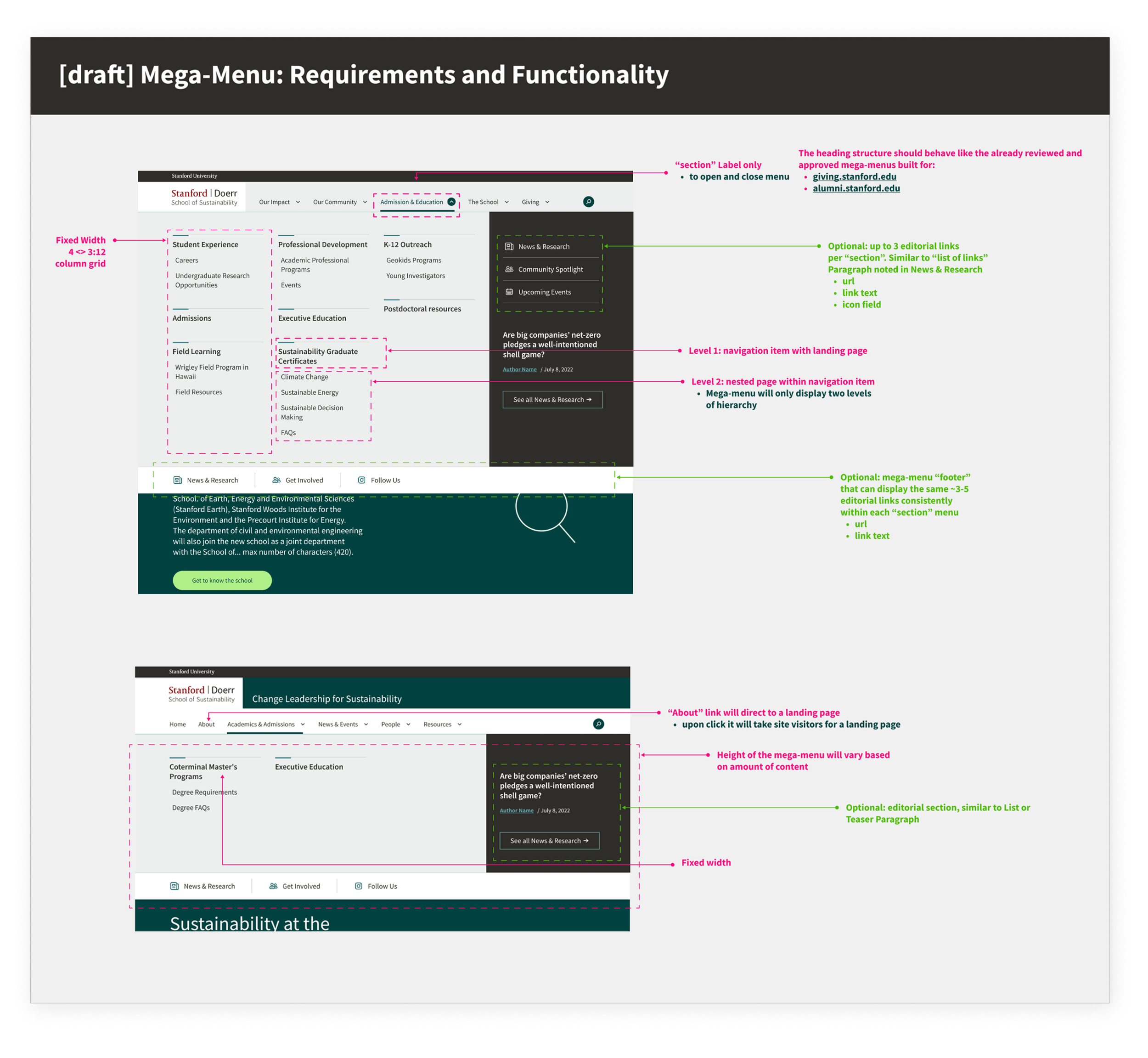
Information Architecture:
Content inventory: reviewed all content to understand what we were organizing
Mission-driven sorting: catalogued content through the school's core values, prioritizing based on strategic importance rather than stakeholder demands
Content strategy:
Audience-based navigation
Action oriented quick links
Strategic space to feature groundbreaking research and news
This process revealed natural groupings and
established website goals that we could focus on.
Design Strategy
Now that we understood what we needed to show in the navigation. We used the tried and true principle of visual design for how to show the information!
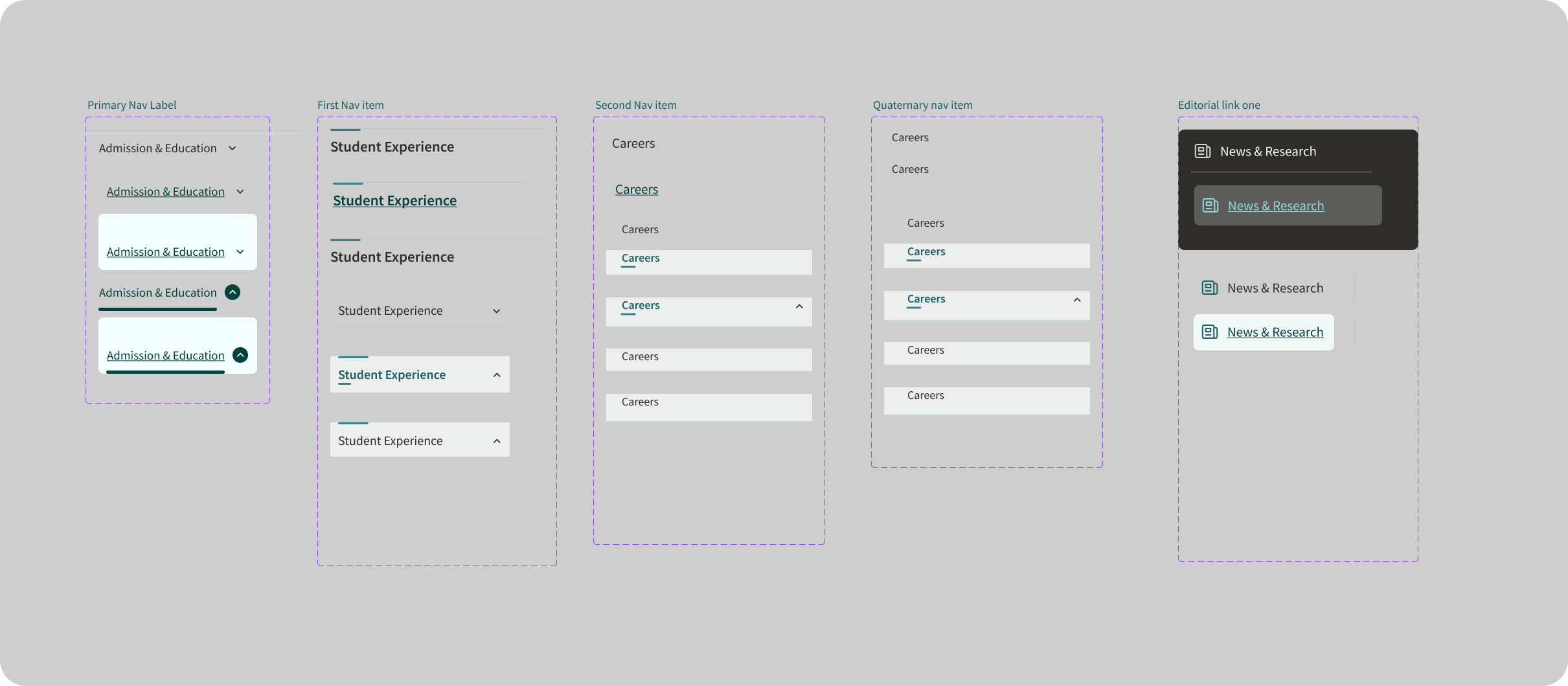
Visual hierarchy to ensure users can scannability
Clear sectioning through whitespace and dividers,
Grid-based layouts for predictability
Columns limited to 5-9 items per section,
Bold category headers
Progressive Disclosure to gradually reveal complexity:
Layered navigation with primary categories and subcategories
Featured content provides a direct pathway
Results
Comprehensive navigation that guides rather than overwhelms by focusing on breadth vs depth to:
Reduce clicks
Cover more content (without more clicks)
Mega-menu becomes a competitive advantage, clearly visualizing the website structure, with good architecture and hierarchy.

Note: While stakeholder approval was secured, leadership and budgetary changes shifted priorities. This case study showcases the design process, strategic problem-solving, and solutions developed for future implementation.
More Work

